


Let’s be honest – websites are a dime a dozen these days. As of March 2023, there were 628.5 million registered domains. But not all websites are equal. And you have the power to make yours stand out in any crowd (even a crowd that’s more than 600 million strong). But first, you need a website that works!
From finding your brand voice to creating a cohesive flow, there are a few must-haves any great website needs. But before your website can flow, it needs to exist. If you’re reading this and wondering how to make a website for your family photography business, you’re in the right spot. I want to break down the essentials for you, page-by-page, so that your website can WORK for you. It’s one of the best lead generators we have at our fingertips, so let’s find a way to draw in those dream clients one page at a time!
Home Page
The second someone clicks the link in your Instagram bio or finds you in a Google search, they’re going to land on your home page – and first impressions really matter. Research has shown that it only takes one tenth of a second to make up our minds about people, and those numbers only slow down a little bit when we pivot from in-person meetings to website views.
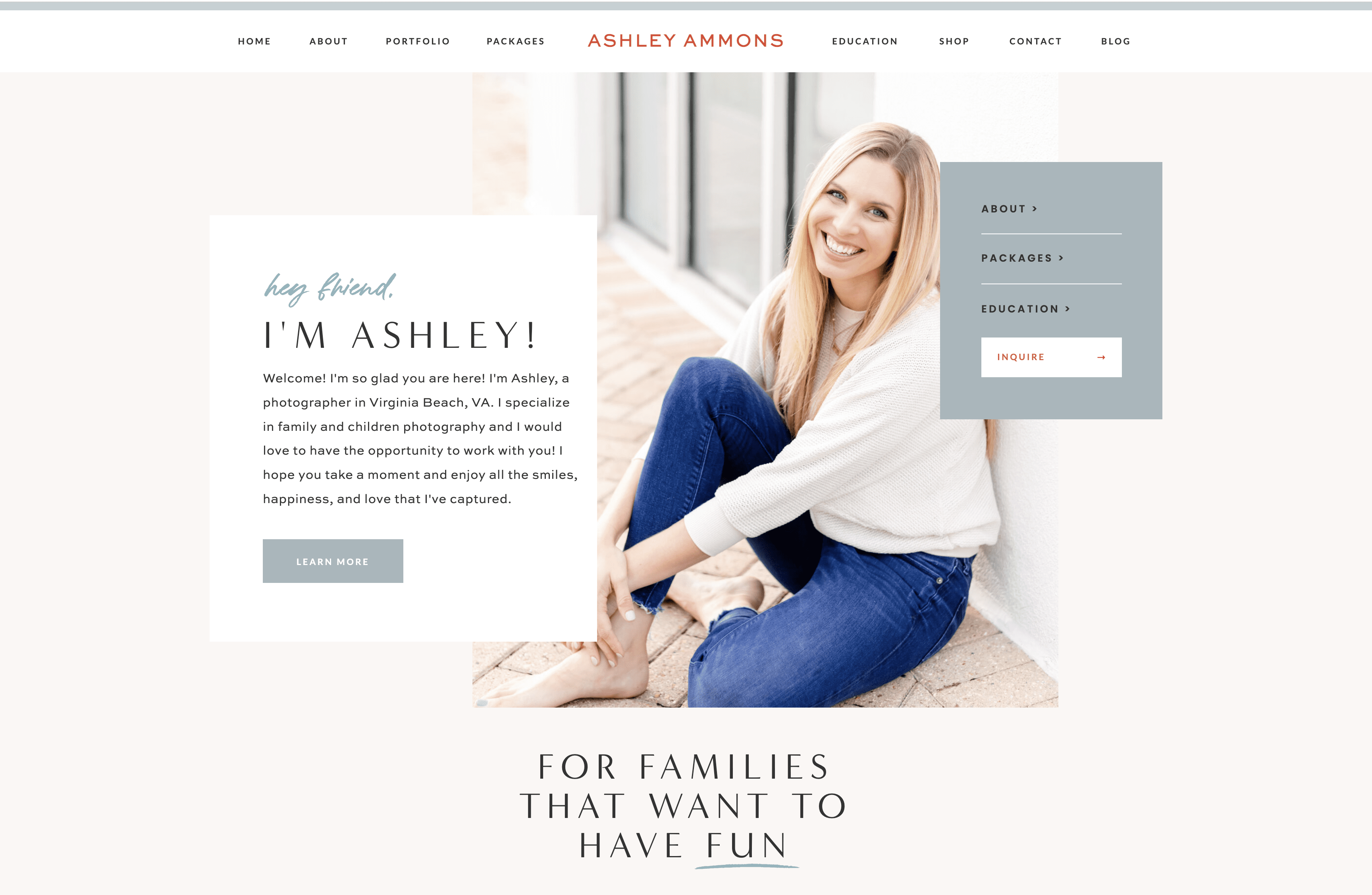
This means your home page needs to be clear in every way. Does your brand capture your photography style? Is important information about your business easy to find? This two-item checklist can make the difference between a casual website viewer and a booked client. If you include nothing else on your home page, make sure these four things are listed quickly and clearly:
- The name of your business: Whether this is in your logo at the top corner or listed as the header text on your home page, people need a clear reminder of who you are.
- What you do: It’s a common mistake — photographers think that because photos are featured prominently on their site, viewers will automatically know they’re photographers! This isn’t actually true. Tell your website visitors what you do, and get specific wherever you can.
- Where you work: If you’re an incredible family photographer in Texas, a website visitor in California probably isn’t going to book you. Make sure you mention where your home base is, even if you travel. Mentioning a location is helpful for SEO and for viewers.
- Who you serve: Once you list your niche, speak to the people who are in it! Potential clients are looking for a photographer they can connect with. Be sure you address them on your home page!
HOW THIS LOOKS: Need an example? Check out the first paragraph on my website. “Welcome! I’m so glad you are here! I’m Ashley, a photographer in Virginia Beach, VA. I specialize in family and children photography and I would love to have the opportunity to work with you! I hope you take a moment and enjoy all the smiles, happiness, and love that I’ve captured.”
About Page
Here’s a secret: your about page isn’t necessarily about you — or at least it’s not ONLY about you. This page gives you a valuable opportunity to tell website visitors your story and invite them into it. Explain how your passions and talents can serve THEM. Of course, it’s important to show off your personality a bit – but don’t miss the chance to help your future clients envision themselves behind your camera. A website that works ALWAYS puts the viewer in the spotlight, and your about page should do that as well!
Pricing Page
When it comes to pricing details, less is more. So many of us feel like we should explain every detail of our package information — but in our quest to be helpful, we can actually overwhelm potential clients. Your pricing page is not meant to be a detailed guide; it’s meant to get your potential clients to learn more by inquiring with you directly. Here are some pricing page pro tips:
- Instead of listing specific costs, try “average amount spent” or “investment begins at” to give website viewers a general idea of what it costs to work with you. If your general costs are not in their budget, you’ll save yourself time responding to leads that were not going to pan out anyway.
- Stay high-level with your package information. There will be plenty of time to chat through the details with clients who have booked (or are highly interested in) a session with you. You can give clients a “what to expect” guide, styling tips, and lots of other great information once you’re chatting with them! But on your site, keep it simple: session length, number of images, and ballpark cost.
- This is the most important part of all, and so many websites miss it: include an inquiry call-to-action (CTA)! I cannot emphasize this enough: don’t make it hard for people to book you. Create a quick form at the bottom of your page that potential clients can fill out right away.
Galleries Page
There are so many ways to highlight your favorite shots as a photographer. But I’ve found that grouping my portfolio by the session has been a much better selling tool for my clients — and that’s what’s most important. Instead of grouping all of your favorite photos in one generic gallery, try session highlights!
This allows website viewers to get a glimpse into what their session images might look like.
My personal recommendation? Highlight 3-4 of your favorite recent sessions, and update this page regularly so that potential customers can see your current style and talent.
Contact Page
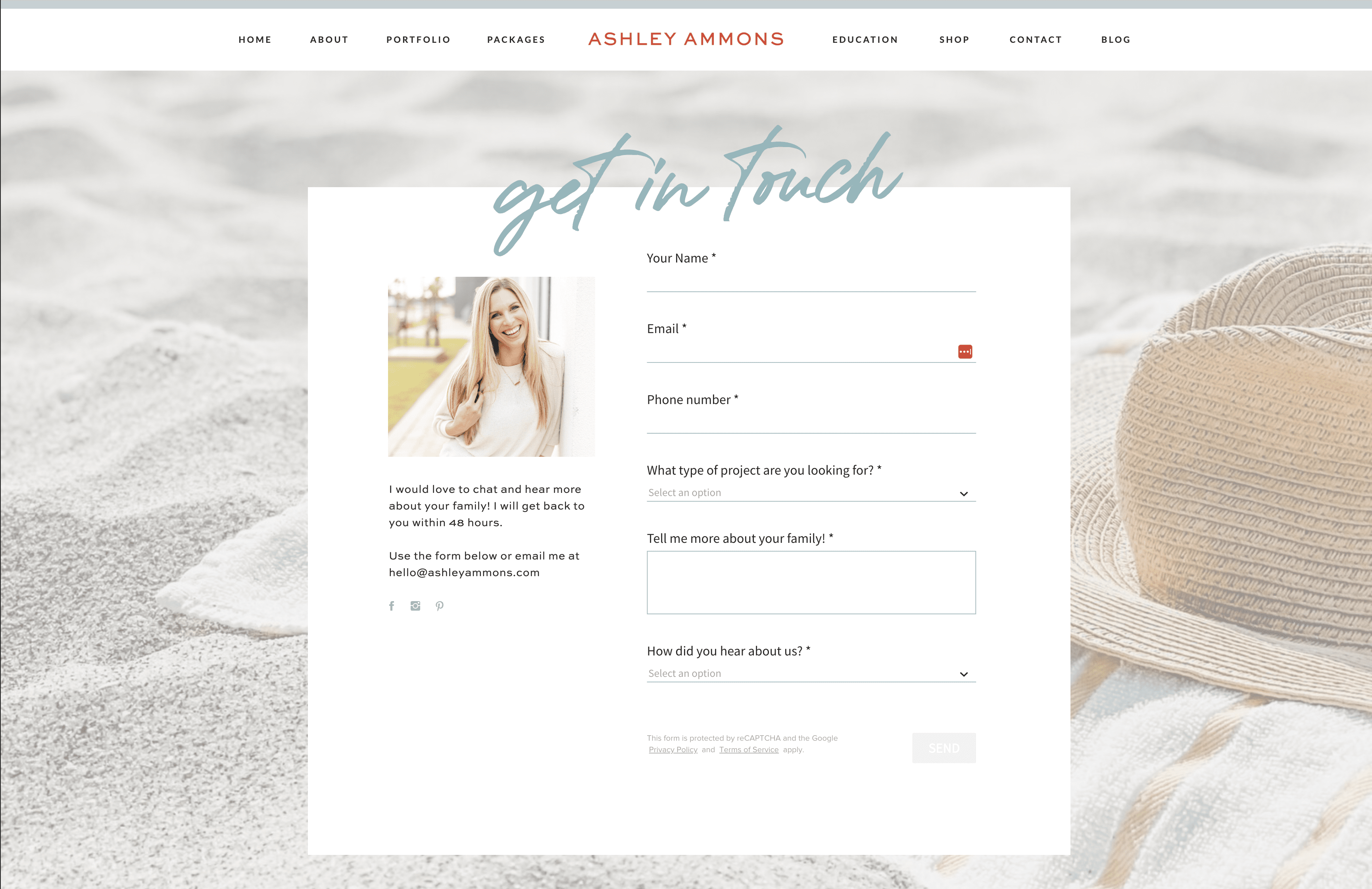
There are really only two rules when it comes to contact pages: make it simple and make sure it works. I recommend filling out your own contact form monthly just to ensure those inquiries are actually getting to your inbox! Make sure to let people know when they should expect a response (and, of course, be a photographer of your word and actually respond in that amount of time).
It’s also a good idea to offer an alternative form of contact, like an email address. That way, if someone has a question about your work or wants to chat through something different than your form outlines, they know how to reach you!
A Website Platform that Works
In my opinion, a great website that works only needs those five pages. Feel free to add a FAQ section on your contact page to eliminate redundant questions. You can also add a blog to inspire and educate your viewers (and boost your SEO!). But remember, you don’t need a dozen pages to make a meaningful impression online.
If you’ve been looking for the perfect platform for your photography website, I really recommend ShowIt. There’s never been a better time to make the switch because I’m giving you an entire month for free. Once you check out this website builder, I think you’ll love it just as much as Lauren and I do! With customizable templates and easy gallery uploads, it’s a photographer’s dream.
Get your free month of ShowIt here!


_Functional Normal")

- Hide Comments